On a Thursday evening in February 2007, Josh Willis stood in front of his laptop, his wife cajoling him to get ready to go out to dinner. He looked with a sinking feeling at the map he had just made. Willis, a scientist at NASA’s Jet Propulsion Laboratory, specializes in making estimates of how much heat the ocean stores from year to year.
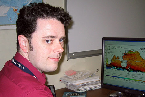
Josh Willis is an oceanographer at NASA’s Jet Propulsion Laboratory who specializes in sea level trends and the response of the oceans to global warming. (Photograph courtesy Josh Willis.)
“The oceans are absorbing more than 80 percent of the heat from global warming,” he says. “If you aren’t measuring heat content in the upper ocean, you aren’t measuring global warming.”
In 2004, Willis published a time series of ocean heat content showing that the temperature of the upper layers of ocean increased between 1993-2003. In 2006, he co-piloted a follow-up study led by John Lyman at Pacific Marine Environmental Laboratory in Seattle that updated the time series for 2003-2005. Surprisingly, the ocean seemed to have cooled.
Not surprisingly, says Willis wryly, that paper got a lot of attention, not all of it the kind a scientist would appreciate. In speaking to reporters and the public, Willis described the results as a “speed bump” on the way to global warming, evidence that even as the climate warmed due to greenhouse gases, it would still have variation. The message didn’t get through to everyone, though. On blogs and radio talk shows, global warming deniers cited the results as proof that global warming wasn’t real and that climate scientists didn’t know what they were doing.
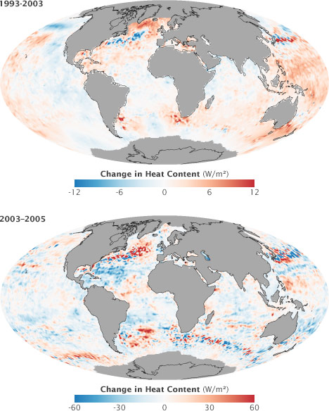
Josh Willis and his colleagues concluded that the world’s oceans gained heat in the decade from 1993 to 2003 (top). However, a follow-up study for the years 2003 to 2005 showed a surprisingly large decrease in heat content—about 5 times as large as the previous decade’s warming (bottom). Areas that warmed are red, while areas that cooled are blue. Note that the scale of each map is different: the 1993–2003 map ranges from -12 to +12 watts per square meter, while the 2003–2005 map ranges from -60 to 60.
Willis initially interpreted the cooling as a temporary fluctuation, a “speed bump” on the road to global warming. (Maps by Robert Simmon, based on data from Josh Willis and John Lyman.)
That February evening, Willis says, he was updating maps and graphs with the data that had become available since the 2006 ocean cooling paper was published. He was preparing for a talk he had been invited to give at the National Center for Atmospheric Research in Boulder, Colorado. The topic was “Ocean cooling and its implications for understanding recent sea level trends.”
He was looking at a map of global ocean temperatures measured by a flotilla of autonomous, underwater robots that patrol the world’s oceans. The devices—Argo floats—sink to depths of up to 2,000 meters, drift with the currents, and then bob up to the surface, taking the temperature of the water as they ascend. When they reach the surface, they transmit observations to a satellite. According to the float data on his computer screen, almost the entire Atlantic Ocean had gone cold. Unless you believe The Day After Tomorrow, Willis jokes, impossibly cold.
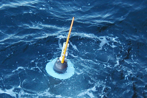
Argo floats are aquatic robots that measure ocean temperature, pressure, and salinity at depths of up to 2,000 meters. The floats augment satellite, ship, and buoy measurements of the ocean. (Photograph © 2004 Sabrina Speich, Argo Information Centre.)
“Oh, no,” he remembers saying.
“What’s wrong?” his wife asked.
“I think ocean cooling isn’t real.”
On the opposite side of the country, Takmeng Wong and his colleagues at NASA’s Langley Research Center in Virginia had come to the same conclusion. Since the 1980s, Wong has studied the most fundamental climate variable of all: the net flux of energy at the top of the Earth’s atmosphere—how much solar energy is coming in minus how much the Earth reflects and radiates as heat.

Takmeng Wong uses satellites to measure the exchange of energy between the Earth and space. (NASA photograph courtesy Langley Research Center.)
“Our team has been involved for many years in constructing time series of net flux from satellite data, going back to the 1980s,” says Wong. The observations started with a satellite mission called the Earth Radiation Budget Experiment and today are being made with Clouds and the Earth’s Radiant Energy System (CERES) sensors on NASA’s Terra and Aqua satellites.
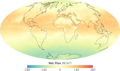
Net flux is the difference between the energy absorbed by the Earth and the energy the Earth reflects or releases as heat. If net flux is positive (red), more energy is coming in than is going out. Most of the excess energy is stored by the oceans. (Map from NASA Earth Observations, based on Flashflux data.)
Wong and his teammates’ record of net flux measured by NASA satellites shows that between the mid-1980s and the end of 1990s, the amount of incoming and outgoing energy at the top of the atmosphere crept out of balance. By the end of the period, about 1.4 watts per square meter more energy was entering the Earth system than leaving it.
Stitching the observations from multiple sensors into a coherent long-term record is complicated. Scientists are always looking for ways to check the accuracy of these pieced-together climate records. Since the ocean is the planet’s single biggest reservoir for surplus energy, the energy imbalance Wong and his colleagues detected in net flux observations ought to be detectable in ocean heat content, too. The connection between these two related, but independently measured vital signs of Earth’s climate brought Wong and Willis into collaboration in 2006.
“When Josh Willis published his first global estimates of ocean heat storage, we saw it as a chance to verify the accuracy of our energy balance time series against a completely independent set of measurements. Josh gave us data on ocean heat storage through 2002, and we compared it to our net flux estimates. There was good agreement, and so we published a paper on that together.”
“We continued to update our net flux time series each year, and we concluded that the positive energy imbalance that we detected previously remained the same,” says Wong. So he was surprised, even a little alarmed, when Lyman and Willis’ reached the opposite conclusion in 2006, saying that the ocean had cooled.
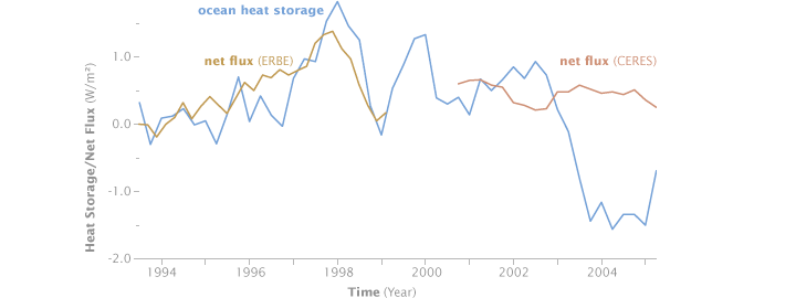
From 1993 to 2003, measurements of heat storage in the oceans agreed with satellite observations of net flux. After 2003, however, surface observations suggested that the ocean was losing heat, while satellite measurements of net flux showed the Earth was still slowly gaining energy. This mismatch was a hint that there might be a problem with one of the data sets. (Graph courtesy Takmeng Wong, NASA Langley Research Center.)
Willis admits the results were puzzling, but the apparent contradiction didn’t automatically convince him the ocean heat data were wrong. A large pulse of melt water from glaciers and ice sheets might account for a rise in sea level even as the ocean cooled and contracted.
The possibility that melting during the period had been large enough to offset a sea level drop became more remote later in 2006, with the release of several studies based on data from NASA’s Gravity Recovery and Climate Experiment, or GRACE, mission. Launched in 2002, the GRACE mission measures changes in Earth’s gravitational field over space and time. Changes in the gravity field are a sign that mass has shifted from one location on Earth to another, like the transfer of water to the ocean when ice sheets and glaciers melt.
When scientists began analyzing the first few years of GRACE data, they concluded that Greenland and West Antarctica were definitely melting and contributing to a rise in sea level. But, says Wong, “The amount did not seem to be enough to offset a cooling as large as they had reported.”
“We let Josh know, diplomatically of course, that all signs were pointing toward his data,” says Wong.
“I was aware that they were not seeing this huge cooling that we were seeing in the ocean,” says Willis. “In fact, every body was telling me I was wrong. And there were always doubts,” says Willis. “After all, it was a very surprising result. As a scientist, its part of my job to turn over every leaf. So I was constantly going back over the data and looking for problems.”
For nearly a year after the 2006 ocean cooling paper was published, nothing obvious turned up. It wasn’t until that next year of data came in that the cooling in the Atlantic became so large and so widespread that Willis accepted the cooling trend for what is was: an unambiguous sign that something in the observations was “clearly not right.”
When scientists mistrust their data, they do they same thing you do when you think your watch is off: they check another clock. To diagnose the problem in the Atlantic, Willis needed to compare ocean temperature measurements from multiple sources. The first source he turned to was sea level data from satellite altimeters.
Because water expands when it absorbs heat, and contracts when it cools, sea level is physically connected to heat content in the upper ocean. Satellite altimeters measure sea surface height with radar. The radar sends a pulse of energy toward the Earth’s surface and listens for the echo. The time delay and intensity of the echo reveal the altitude of the sea surface.
Willis also had ocean-based data sets, including temperature profiles from the Argo robot fleet as well as from expendable bathythermographs, called “XBTs” for short. XBTs are the equivalent of a disposable razor. A temperature sensor is spooled out behind a ship by thin copper wire. It sinks, making measurements at increasing depths, transmitting them back to the ship via the wire until the line snaps and the sensor sinks to the bottom of the ocean, discarded.

An XBT may look like a rocket, but it’s more like a fishing weight: a heavy zinc nose houses a thermistor (to measure temperature) attached to a spool of copper wire. The XBT is launched from a ship, then falls through the water at a constant rate. Temperature measurements are sent back to the ship through the wire until the entire length of wire is unspooled (up to 1,500 meters), at which point the connection breaks and the XBT falls to the ocean floor. (Render by Robert Simmon, NASA Goddard Space Flight Center.)
The devices are manufactured to free-fall through the water at a known rate; scientists infer the depth of the temperature measurements by the time lapsed after the sensor hits the water. They have been used by the U.S. Navy and oceanographers since the 1960s.
“Basically, I used the sea level data as a bridge to the in situ [ocean-based] data,” explains Willis, comparing them to one another figuring out where they didn’t agree. “First, I identified some new Argo floats that were giving bad data; they were too cool compared to other sources of data during the time period. It wasn’t a large number of floats, but the data were bad enough, so that when I tossed them, most of the cooling went away. But there was still a little bit, so I kept digging and digging.”
The digging led him to the data from the expendable temperature sensors, the XBTs. A month before, Willis had seen a paper by Viktor Gouretski and Peter Koltermann that showed a comparison of XBT data collected over the past few decades to temperatures obtained in the same ocean areas by more accurate techniques, such as bottled water samples collected during research cruises. Compared to more accurate observations, the XBTs were too warm. The problem was more pronounced at some points in time than others.
The Gouretski paper hadn’t rung any alarm bells right away, explains Willis, “because I knew from the earlier analysis that there was a big cooling signal in Argo all by itself. It was there even if I didn’t use the XBT data. That’s part of the reason that we thought it was real in the first place,” explains Willis.
But when he factored the too-warm XBT measurements into his ocean warming time series, the last of the ocean cooling went away. Later, Willis teamed up with Susan Wijffels of Australia’s Commonwealth Scientific and Industrial Organization (CSIRO) and other ocean scientists to diagnose the XBT problems in detail and come up with a way to correct them.
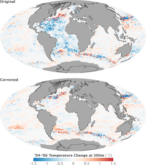
Willis’ map of ocean temperature change from 2004 to 2006 originally showed drops of over 1.5° Celsius in the Atlantic Ocean. The apparent large drop in temperature was due to bad data from the Argo floats and XBTs, and it disappeared when errors in these data sets were corrected. (The remaining large swings in temperature visible in these maps are due to shifting positions of ocean currents.) (Maps by Robert Simmon, based on data from Josh Willis and John Lyman.)
“So the new Argo data were too cold, and the older XBT data were too warm, and together, they made it seem like the ocean had cooled,” says Willis. The February evening he discovered the mistake, he says, is “burned into my memory.” He was supposed to fly to Colorado that weekend to give a talk on “ocean cooling” to prominent climate researchers. Instead, he’d be talking about how it was all a mistake.
A scientist could hardly be expected to be happy about finding a mistake in his work after he published it. But if you have to watch your research go down in flames, it may help to regard it as an offering on the sacrificial fire of scientific progress. In the case of “ocean cooling,” Willis has plenty of reasons to consider the sacrifice worth it.
The first payoff for finding and fixing the XBT errors was that it allowed scientists to reconcile a stubborn and puzzling mismatch between climate model simulations of ocean warming for the past half century and observations. The second was that it helped explain why sea level rise between 1961-2003 was larger than scientists had previously been able to account for.
Much of what scientists know about how ocean heat content has changed over the past half century comes from the work of Sydney Levitus, the director of NOAA’s Ocean Climate Laboratory in Silver Spring, Maryland, and his colleagues. In the early 1990s, the United Nations Education and Scientific Organization (UNESCO) asked Levitus to undertake a scientific rescue mission.
The group wanted Levitus to locate historical ocean data sitting around in dusty library stacks, moldy basements, and forgotten filing cabinets around the world before they were lost to natural disaster or neglect. The project became known as the Global Oceanographic Data Archeology and Rescue Project (GODAR).

Historical climate records provide important context for modern measurements. This type of XBT was used in the mid-1960s. (Photograph courtesy NOAA Photo Library.)
“Since 1993 or so, we have added several million historical temperature profiles. This collection allowed us for the first time to estimate the change in ocean heat content from 1955 on. When we first published these results in 2000, they received a great deal of media, congressional, and scientific attention, because the warming that we saw was consistent with what would have been expected due to the increased greenhouse gases in the atmosphere,” recalls Levitus.
What wasn’t consistent was several large bumps in the graph of heat content over time. “We saw an overall linear [warming] trend that was consistent, “ says Levitus, “but we also saw some very large interdecadal variability. In particular, toward the late 1970s, heat content increased substantially and then around 1980, it decreased substantially.”
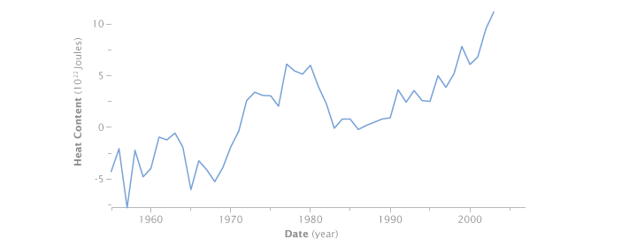
The global ocean heat content trend reconstructed by the Global Oceanographic Data Archeology and Rescue Project showed an overall increase from 1955 to 2003, but there were large unexplained swings. (Graph by Robert Simmon, based on data from GODAR.)
“Those bumps gave everyone heartburn,” says Willis. There was no established physical explanation for them, and climate models didn’t reproduce them. The science community wasn’t sure whether the discrepancy cast doubt on the models or the observations, but fingers got pointed in both directions.
In mid-2008, however, a team of scientists led by Catia Domingues and John Church from Australia’s CSIRO, and Peter Gleckler, from Lawrence Livermore National Laboratory in California, revised long-term estimates of ocean warming based on the corrected XBT data. Since the revision, says Willis, the bumps in the graph have largely disappeared, which means the observations and the models are in much better agreement. “That makes everyone happier,” Willis says.
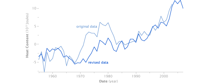
The same flaws in the XBT data that affected Willis’ ocean heat maps showed up in the long-term historical trend (light blue). After applying a correction, the historical record shows a relatively steady increase in line with what’s shown by climate models. The remaining short-term variability is as likely to be natural variation, such as El Niño, as noise in the data. (Graph by Robert Simmon, based on data from GODAR.)
Levitus agrees that the interdecadal variability is substantially decreased, but it isn’t totally gone. He argues that before anyone assumes that the observations must be wrong, they should remember that the amount of variability they are talking about is probably less than the amount of heat gained and lost during the intense El Niño in 1997-98. “Climate models don’t reproduce El Niño events very well either,” he says, but no one doubts they are real.
Although he has “caused a stir” among his colleagues in the past by criticizing models’ inability to simulate how ocean heat storage varies on short-term time scales, he stresses, “I have said from the beginning that the fact that the long-term trends in models and observations do agree so well is what is most important.”
“My point is just that we need to remain open-minded because it may be that it is possible for the ocean to gain heat and lose it more rapidly than we think. There may be other phenomena [similar to El Niño] operating on different time scales that can explain interdecadal increases and decreases,” says Levitus. Even if these ups and downs don’t change the long-term destination of global warming, they could reveal more detail about what kind of ride we can expect.
For CSIRO scientist Catia Domingues and her colleagues, being able to show that climate simulations and observations were in better agreement than they previously seemed was only the first payoff of the corrections to the XBT data. The second was that they used the revised data to balance the sea level budget for 1961-2003.
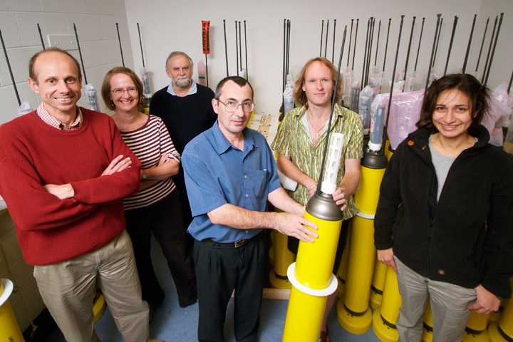
Catia Domingues (far right) and other scientists on the CSIRO team stand in a room full of Argo floats. (Photograph courtesy Commonwealth Scientific and Industrial Research Organisation.)
The two main causes of sea level rise are melting of Earth’s frozen landscapes—ice sheets, ice caps, and glaciers—and thermal expansion. Water expands when it absorbs heat. If you add the amount of thermal expansion to the amount of melting, it should equal the observed sea level rise, but somehow, it never did.
“When scientists added these terms, the sum was always less than the observed sea level rise measured by tide gauges and satellite altimeters. It’s like one plus one did not equal two,” says Domingues.
Rising sea level is one of the most serious consequences of global warming. In the past 50 years, sea level rose about 1.8 (plus or minus 0.3) millimeters a year. Satellite observations since 1993 indicate the pace has accelerated to about 3 millimeters per year. What’s driving the acceleration? How much and how fast will sea level rise in the future? In trying to answer these questions, scientists repeatedly tried to balance the sea level budget, and they repeatedly came up short.
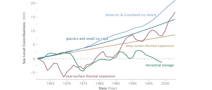
In principle, it should be possible to add up each of the individual components of sea level rise—melting continental ice sheets in Antarctica and Greenland, retreating glaciers, the thermal expansion of near-surface water, thermal expansion of the deep ocean, and changes in water storage on land—to calculate the total rise over time. Unfortunately, early attempts to balance the sea level budget never added up. Each line on this graph shows how many millimeters each process added to or subtracted from total sea level since the early 1960s. (Graph adapted from Domingues 2008.)
“Susan Wijffels and her colleagues from here at CSIRO, along with Josh Willis, provided a way to correct the XBT data, and so we took those corrections and made the first revised estimates of sea level rise due to ocean warming for the period 1961 to 2003. What we found was that ocean heating was larger than scientists previously thought, and so the contribution of thermal expansion to sea level rise was actually 50 percent larger than previous estimates.”
It seems that the main reason the sea level budget between 1961 and 2003 would not add up before is that scientists were underestimating just how much warming and expanding the ocean was experiencing. But what about more recent changes in sea level?
“In this analysis, we focused on 1961-2003 because it is the time period highlighted as being an important, unresolved issue in the last IPCC report [Intergovernmental Panel on Climate Change Fourth Assessment Report],” said Domingues, “but also because the problems with the newest Argo data—the problems that Josh Willis found as well as other problems we have identified—haven’t been totally solved. For the most recent years [2003-2007], the sea level budget once again does not close. Our team is still working on that problem.”
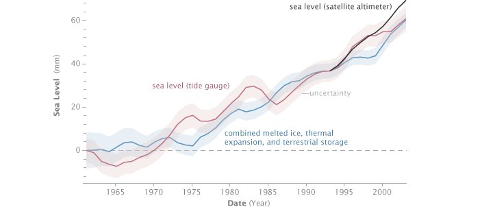
The corrected XBT data resolved much of the discrepancy between calculated and observed sea level rise by increasing the amount of change contributed by thermal expansion. Now, the combined effects of melting ice, thermal expansion, and terrestrial storage (blue line) match measurements from tide gauges (red line) and satellite (black line) more closely—at least until the late 1990s. The shading around each line shows the range of uncertainty in the estimates; the actual value for the year may fall anywhere within the shaded area. (Graph adapted from Domingues 2008.)
They are also exploring how volcanic eruptions influence ocean heating, and whether a better understanding of how volcanoes influence the energy balance of the ocean will help explain short-term variability in ocean warming and cooling.
“One thing we found was that climate models that do not include volcanic forcing tend to overestimate the long-term change, and their simulated decadal variability is not in agreement with the observations. On the other hand, the models that include volcanic forcing are more realistic in terms of decadal variability, but they tend to slightly underestimate the long-term warming,” she says. “This kind of result tells us volcanic forcing is important, but that we don’t totally understand it yet.”
If there is a moral to this story, it’s that when it comes to understanding the climate system, it’s hard to imagine too much redundancy. Every scientist involved in these studies says the same thing: to understand and predict our climate and how it is going to change, we need it all.
We need multiple, independent, overlapping sets of observations of climate processes from space and from the Earth’s surface so that we can create long-term climate records—and have confidence that they are accurate. We need theories about how the parts of the Earth system are related to each other so that we can make sense of observations. And we need models to help us see into the future.
“Models are not perfect,” says Syd Levitus. “Data are not perfect. Theory isn’t perfect. We shouldn’t expect them to be. It’s the combination of models, data, and theory that lead to improvements in our science, in our understanding of phenomena.”
